 准备工作需要引用外部字体库,实际开发中最好就是下载到本地
- <!-- 引入font-awesome字体图标库 -->
- <link rel="stylesheet" href="https://cdn.staticfile.org/font-awesome/4.7.0/css/font-awesome.css">
HTML代码用于总体布局:
- <div class="menu-box">
- <!-- 图标按钮 -->
- <div class="menu-button">
- <div class="line-box">
- <div class="line"></div>
- <div class="line"></div>
- <div class="line"></div>
- </div>
- </div>
- <!-- 菜单列表 -->
- <ul class="menu-list">
- <li><i class="fa fa-sliders"></i><span>设置</span></li>
- <li><i class="fa fa-clone"></i><span>复制</span></li>
- <li><i class="fa fa-share-square-o"></i><span>分享</span></li>
- <li><i class="fa fa-trash-o"></i><span>删除</span></li>
- </ul>
- </div>
JS代码用于事件的处理:
- // 要操作的元素
- const menu_box=document.querySelector('.menu-box');
- const menu_button=document.querySelector('.menu-button');
- // 为菜单按钮绑定点击事件
- menu_button.addEventListener('click',function(){
- menu_box.classList.toggle('active');
- })
CSS代码:
- *{
- /* 初始化 */
- margin: 0;
- padding: 0;
- }
- body{
- height: 100vh;
- /* 弹性布局 水平+垂直居中 */
- display: flex;
- justify-content: center;
- align-items: center;
- /* 渐变背景 */
- background: linear-gradient(to top left,#84a0f4,#c2e9fb);
- }
- body::before{
- content: "点击右下角";
- color: #fff;
- font-size: 32px;
- text-shadow: 0 3px 3px #4c6ed3;
- }
- .menu-box{
- /* 固定定位 右下角 */
- position: fixed;
- bottom: 40px;
- right: 40px;
- }
- /* 菜单按钮 */
- .menu-button{
- width: 50px;
- height: 50px;
- background-color: #5c67ff;
- border-radius: 50%;
- /* 投影 */
- box-shadow: 0 0 0 4px rgba(92,103,255,0.3);
- color: #fff;
- display: flex;
- justify-content: center;
- align-items: center;
- position: relative;
- z-index: 1;
- cursor: pointer;
- /* 过渡 */
- transition: 0.2s ease-in;
- }
- .menu-button:hover{
- background-color: #4854ff;
- box-shadow: 0 0 0 8px rgba(92,103,255,0.3);
- }
- .menu-button .line-box{
- width: 20px;
- height: 20px;
- display: flex;
- flex-direction: column;
- justify-content: space-between;
- cursor: pointer;
- transition: transform 0.3s ease-out;
- }
- /* 菜单按钮图标(三条杠) */
- .menu-button .line{
- background-color: #fff;
- width: 100%;
- height: 2px;
- border-radius: 2px;
- }
- /* 前后两条短,中间的长 */
- .menu-button .line:first-child{
- width: 50%;
- /* 设置变换的基点 */
- transform-origin: right;
- /* 过渡效果 */
- transition: transform 0.3s ease-in-out;
- }
- .menu-button .line:last-child{
- width: 50%;
- align-self: flex-end;
- transform-origin: left;
- transition: transform 0.3s ease-in-out;
- }
- /* 菜单列表 */
- .menu-list{
- width: 140px;
- height: 160px;
- background-color: #fff;
- border-radius: 8px;
- list-style: none;
- padding: 6px;
- box-shadow: 0 0 4px 4px rgba(92,103,255,0.15);
- position: absolute;
- right: 15px;
- bottom: 15px;
- /* 默认隐藏 */
- opacity: 0;
- transform: scale(0);
- /* 设置变换的基点 */
- transform-origin: bottom right;
- /* 过渡效果 */
- transition: 0.3s ease;
- /* 过渡延迟 */
- transition-delay: 0.1s;
- }
- /* 菜单项 */
- .menu-list li{
- display: flex;
- align-items: center;
- padding: 10px;
- color: #1c3991;
- cursor: pointer;
- position: relative;
- /* 默认隐藏 */
- opacity: 0;
- transform: translateX(-10px);
- transition: 0.2s ease-in;
- }
- .menu-list li:hover{
- color: #5c67ff;
- }
- /* 菜单项下边框 */
- .menu-list li::before{
- content: "";
- width: calc(100% - 24px);
- height: 1px;
- background-color: rgba(92,103,255,0.1);
- position: absolute;
- bottom: 0;
- left: 12px;
- }
- /* 最后一项不用下边框 */
- .menu-list li:last-child::before{
- display: none;
- }
- /* 菜单项图标 */
- .menu-list .fa{
- font-size: 18px;
- width: 18px;
- height: 18px;
- display: flex;
- justify-content: center;
- align-items: center;
- }
- /* 菜单项文本 */
- .menu-list span{
- font-size: 14px;
- margin-left: 8px;
- }
- /* 活动态下的部分样式变化 */
- /* 三条杠的变化 */
- .active .line-box{
- transform: rotate(-45deg);
- }
- .active .line-box .line:first-child{
- transform: rotate(-90deg) translateX(1px);
- }
- .active .line-box .line:last-child{
- transform: rotate(-90deg) translateX(-1px);
- }
- /* 菜单列表的变化 */
- .active .menu-list{
- opacity: 1;
- transform: scale(1);
- }
- .active .menu-list li{
- /* 执行动画:动画名 时长 线性 停留在最后一帧 */
- animation: fade-in-item 0.4s linear forwards;
- }
- /* 接下来为每一项设置动画延迟时间 */
- .active .menu-list li:nth-child(1){
- animation-delay: 0.1s;
- }
- .active .menu-list li:nth-child(2){
- animation-delay: 0.2s;
- }
- .active .menu-list li:nth-child(3){
- animation-delay: 0.3s;
- }
- .active .menu-list li:nth-child(4){
- animation-delay: 0.4s;
- }
- /* 定义动画 */
- @keyframes fade-in-item {
- 100%{
- transform: translateX(0);
- opacity: 1;
- }
- }
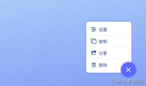
当我们点击右下角更多的时候会展开一个便捷界列表菜单
效果展示: